The Best Colors for Online Conversions


Want to increase your conversion rate?
Look no further than the colors you’re using on your website.
I’ve noticed myself that colors can make a huge difference in the effectiveness of your site, and research backs that up.
With a few simple color tweaks, you can dramatically boost clicks, subscriptions, registrations, and purchases.
All it takes is a little understanding of the colors you want to use and what will work best.
In this article, I’ll explain the impact color can have on your conversion rate.
Then, I’ll demonstrate step-by-step techniques that have been proven to boost conversions on hundreds of sites.
Let’s jump in.
Why does color matter?
Before we talk about how to boost conversions with color, let’s tackle a bigger question first: why does color matter?
The truth is that colors define how we see things. Our brains are hardwired to interpret the world around us through the colors we see.
When it comes to conversions and websites, there are a few ways color changes how we interact.
Colors improve overall site appeal
The first (and perhaps most important) benefit color provides to your site is that it changes the way visitors are drawn to it.
According to data published by WebpageFX, people make a subconscious judgment about your site within 90 seconds of viewing it.
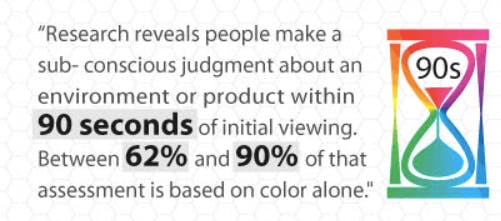
Perhaps even more surprisingly, between 62 percent and 90 percent of that judgment is based on color alone.
Since first impressions are so important, the colors you use have an impact not only on someone’s first impression but also on the way they see your site for the rest of their lives.
It’s a decision you need to consider seriously.
Colors change brand perception
There’s a reason top brands choose a color scheme, publish brand guidelines, and work tirelessly to make sure their design is consistent across all their communication channels.
Color changes how we perceive brands. Even tiny variations make a difference in how we interpret and recognize a brand.
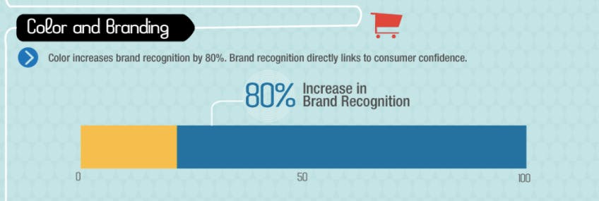
According to data from Kissmetrics, color increases brand recognition by up to 80 percent. That’s huge.
Deciding on (and using) a consistent color for your marketing efforts will pay huge dividends for years to come.
The colors you use also change the overall impression people have of the values your brand represents.
Choosing the wrong color can alter how people perceive your brand, and even tiny tweaks (as we’ll see later) can influence your business’s style and personality.
Colors increase purchases
It’s no surprise that the smallest change in colors influences not only perception but also reality.
The colors you use can change a customer’s buying habits and desire to purchase more (or less) of what you have to offer.
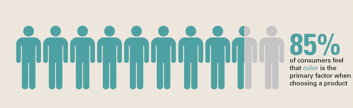
According to Bags and Bows Online, 85 percent of customers feel that color is the primary factor when choosing a product.
Think about the last time you bought a car. Didn’t the color affect your final choice?
The factors influencing the color of your vehicle are markedly similar to those dictating how many items customers add to their carts on your e-commerce store.
Using appropriate color theory is a great way to boost your conversion rate and sell more, or boost whatever action you want visitors to take.
Colors improve memory
Finally, color improves memory. Years ago, the von Restorff effect was discovered, showing that contrasting colors draw attention to themselves.
It’s a fact we see played out in daily life as well.
The Logo Company produced this chart detailing different emotions represented by the colors chosen by brands.
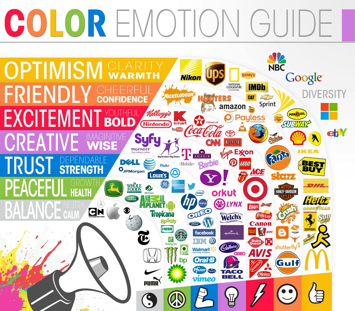
You’ll notice that a few brands stand apart from their peers by using a different color.
Taco Bell, for example, breaks away from most red-and-yellow-based fast food establishment logos with purple, representing its “think outside the bun” concept.
This contrasting effect can be used to boost conversions and increase the effectiveness of your presence online.
Let’s see how you can start choosing the right colors to make huge gains in your marketing strategy.
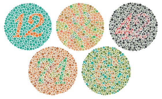
Color Blindness Test
Color Blind Test info: This fairly common condition often goes undiagnosed, because you do not realize you aren’t seeing colors as other people do. Yet testing for color blindness is simple — doesn’t even require a trip to the doctor.
Simply look at the symbols below and enter the numbers that you can see. You’ll get an instant result that will help you if you are struggling with color blindness, and which colors are more problematic.
If the test shows that you may be color blind, and you feel that color blindness is affecting your everyday life, then there is good news for you. Color blindness treatment is available to help you see the full range of colors that other people see and can guarantee the passing of the Ishihara Color Plate Test!
Appeal to the right demographic
To get things started, you should look at the types of colors that appeal to your target user or customer.
If you already have a customer profile or series of user data, you can mine that analysis for information about what kind of person is your ideal target visitor.
From that, you can then calculate what colors will drive the greatest appeal.
The most important factors to consider are gender, age, culture, and buying habits. Here’s how to make the best choices for each of those.
Based on gender
If your demographic is primarily skewed towards men or women, you should adjust your colors accordingly.
According to research published by Kissmetrics, blue is the favorite color of most men and over one-third of women.
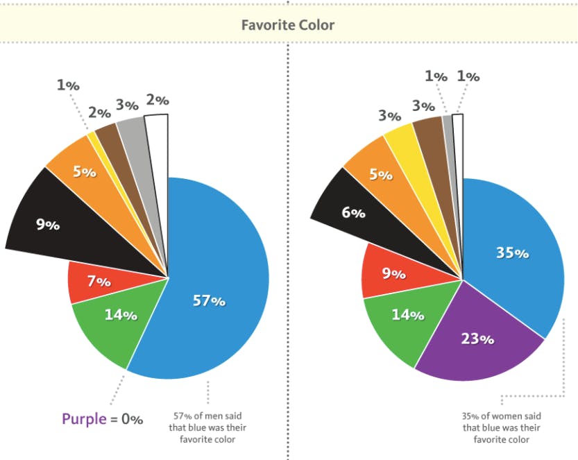
If your content appeals to both men and women, it’s a good idea to stay with blue, green or red.
You could accent with neutral colors like black, white, and gray. I’d recommend staying away from brown and orange for reasons I’ll discuss in a minute.
The most polarizing color is purple, with a full 23 percent of women preferring it and zero percent of men. If you’re appealing to women, this is a great choice, but it will likely turn away male prospects.
You should also be aware of the least favorite colors of each gender. Thanks to information published by Help Scout, the results are clear.
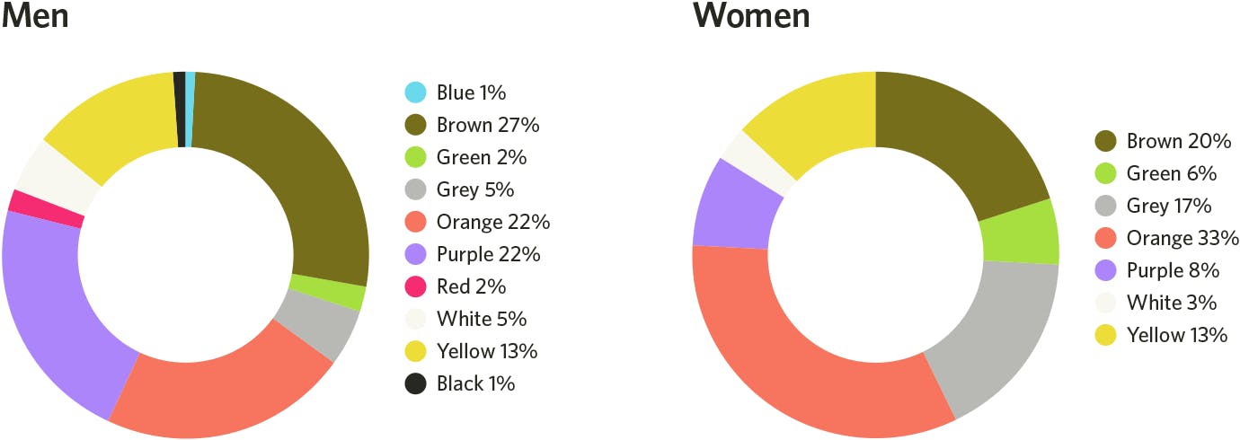
The two colors to stay away from are orange (disliked by 22 percent of men and 33 percent of women) and brown (disliked by 27 percent of men and 20 percent of women).
Yellow is slightly less risky, with 13 percent of men and women showing opposition to it. Purple again shows up as a color to avoid for men, with a full 22 percent disliking it.
Choose the right colors strategically, and make sure you’re using a palette that appeals to your audience. Using the right colors is key in creating visually stunning content.
Based on age
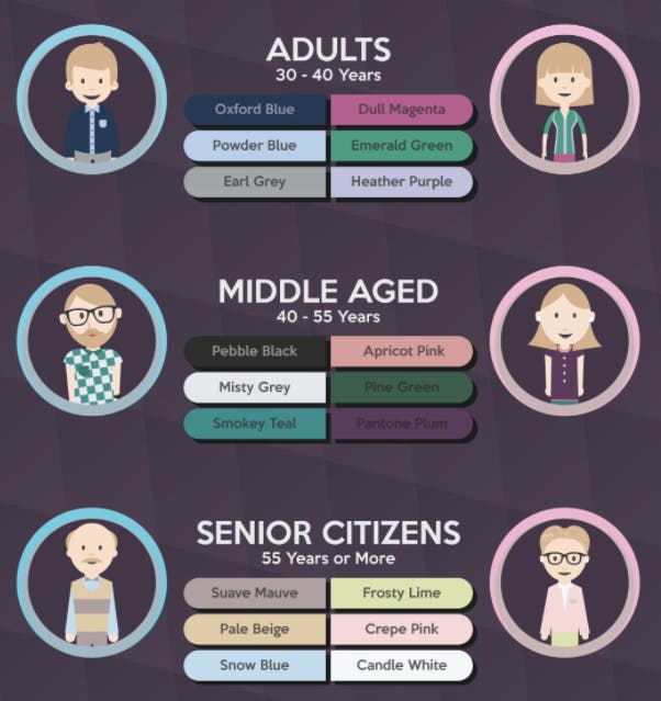
If you have a specific age appeal, you need to be careful of the colors you use to represent your brand and drive conversions.
Colors we find intriguing change as we age, as represented by this infographic by DesignMantic.
Younger audiences are drawn to high-contrast colors, with bright hues or darker tones. Primary colors of blue, yellow, and red tend to elicit a stronger reaction.
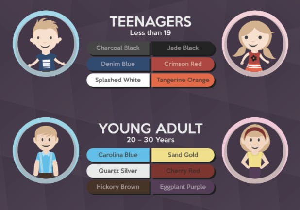
As we age, that spectrum shifts to lighter tones and more pastel colors, with pinks and teal drawing more attention.
If you’re looking for colors to avoid by age, you don’t need to worry too much.
According to research published by Joe Hallock, different ages stay relatively consistent with least favorite colors.
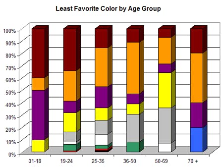
No matter what the age of your demographic, you should stay away from orange and brown, with a careful consideration of purple, yellow, and gray.
Based on culture
If you have a large international audience or if you want to appeal to a group of people outside your country, you need to do careful research.
The scope of cultural color preferences is beyond this article, but a brief example shows the importance of choosing colors wisely.
Americans and those in the UK see blue as a positive color, eliciting patriotism or serenity, according to data by Amara.
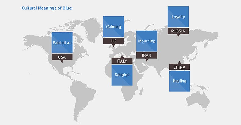
But this meaning shifts entirely in Iran, where the color blue is associated with mourning.
Be careful if you’re creating a color scheme for an international audience.
Based on buying habits
Finally, you should base the colors you choose on the buying habits of your customers. According to data by Kissmetrics, colors influence how we interpret what we purchase.
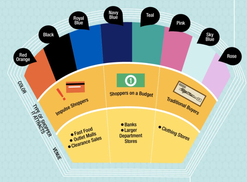
If you’re looking to attract impulse buyers, look to red, orange, black, and royal blue. Shoppers on a budget, however, will find navy blue and teal hues appealing.
Meanwhile, lighter pinks and blues will find appeal with traditional buyers. The colors you choose change how people view your offerings, so choose carefully.
Improve your message with color psychology
If you want to make a huge change in your conversion rate, you need to understand the research that’s gone into how humans interpret the colors we use.
Having a detailed knowledge of the psychology of color will increase conversions and make your web pages more effective.
This chart published by ConvertKit shows the different types of impressions you can make by simply changing the color of a buy button.
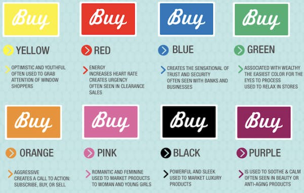
Each of those colors has a specific meaning. Let’s look at them individually.
Blue leads to trust and dependability
As the most popular color (as indicated by the research I showed earlier), it’s no surprise that blue indicates a variety of benefits.
The most notable feature of blue is trust and security. According to TechKing, it’s also a sign of calmness and tranquility.
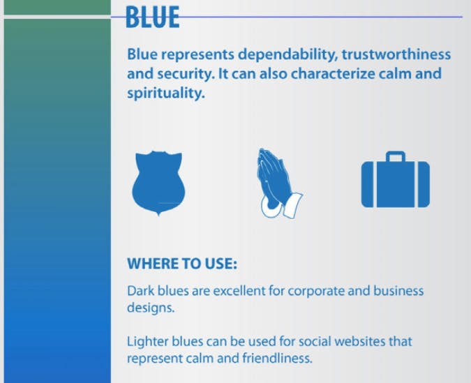
If you’re an established company (or looking to become one), blue is a stable choice that allows for an appearance of stability and knowledge.
It’s also calming and an all-around good choice for a brand that represents friendliness and approachability.
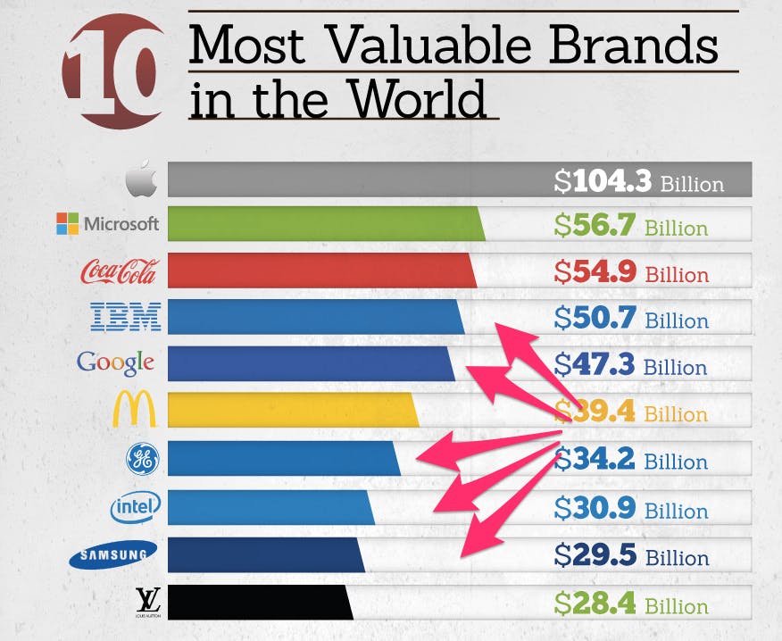
It should come as little surprise that five of the top ten brands in the world feature blue as a primary color, according to FinancesOnline.
You can add a sense of value and trust to your offers by using blue next to your calls to action.
Yellow indicates warning or optimism
Yellow grabs our attention and forces us to look, which is why it’s used in a variety of warning contexts and for traffic signs.
It’s also a color usually associated with sunlight, leading to a feeling of optimism and play, according to The Logo Factory.
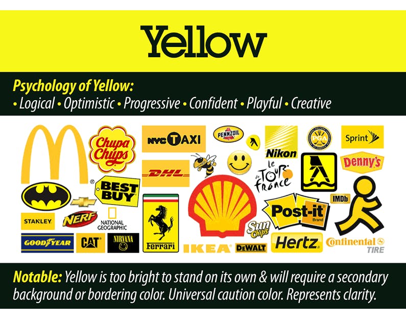
While yellow makes an offer more appealing and positive — and it can be used to great effect if you’re inducing a warning with your message — it comes with a serious downside: readability.
Used by itself, yellow is almost impossible to read. There’s a reason most brands that incorporate yellow into their logo outline the design and write the letter in another color.
To use this effectively, consider using yellow sparingly as a background color for a call to action button, and writing the text inside that button in a contrasting color like black.
Red represents energy, anger, and appetite
There’s a reason red is a great color for impulse buying.
According to Webpage FX, red instigates strong emotions. It can be used in marketing to increase the pressure of something or indicate urgency.
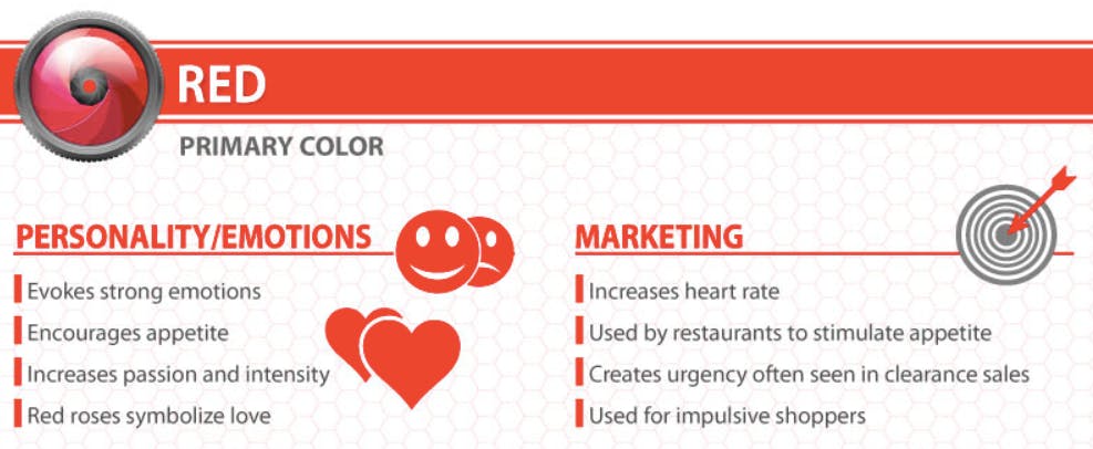
If you’re in the food industry, red also stimulates appetite. There’s a reason dozens of restaurants, from Wendy’s to Chipotle, use red as an accent color in their branding.
You can also use it to incite passion or intensity.
To make good use of red to boost your conversion rates, include it beside or with urgent messaging, or for high-pressure decisions.
Green is good for environmental causes and standing apart
Green represents a fresh way of doing things, and it means “go,” according to The Logo Factory. It also has a strong leaning on environmental signifiers.
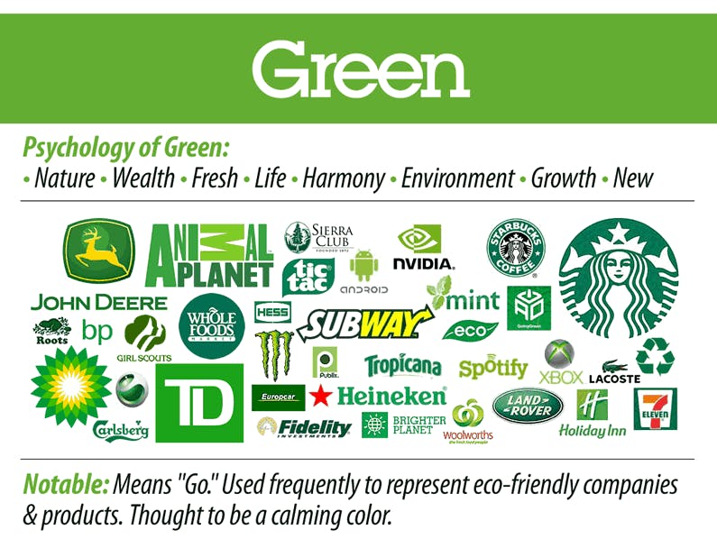
Green also has a calming effect, and it can be used to put customers at ease or provide a sense of welcome, as used in the Holiday Inn and Starbucks logos.
To make good use of green in your marketing, consider it as an accent color for a company with exciting ideas or a new way of doing things.
Consider it also for representing an environmental side to your brand, as Animal Planet and the Sierra Club do well.
Also, green can be used as an indicator of action for a cause or to invite customers in a gentle way.
Orange means fun or impulse
According to Marketo, orange combines the brightness of yellow with the energy and boldness of red, giving it a combination of emotion all its own.
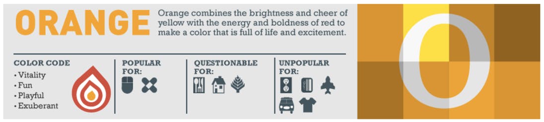
Because orange isn’t used often, it will stand out from the main colors used by most companies.
Implement it for a taste of playfulness, excitement, and fun.
Because of its high contrast with other more subtle colors like blue and green, orange can be a great color to draw attention to your call to action.
Use it as a primary button color or as an arrow to focus attention to a place where you’d like the user to click.
Pink represents romance and femininity
If you’re appealing to men, it’s a good idea to stay away from pink. But if you want to make a unique gender appeal, pink can send a message all its own.
Unlike the other colors, which have a broader gender appeal, pink makes it obvious within minutes who your target demographic is, according to Painters of Louisville.
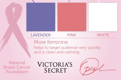
If you’re looking to create a brand that represents women or romance, pink is the perfect color. It can also make a good accent for products related to babies and children.
To use it effectively to increase conversions, add it only to pages that represent this type of market.
No matter how powerful the contrast, pink will probably hurt the conversion rate of any page not directly tied to one of its associated meanings.
Purple is associated with luxury and imagination
While it isn’t considered a common favorite color, purple can imply a lot of different emotions, and it’s one of the most far-reaching colors in terms of implications.
According to Finances Online, purple has a feeling of luxury, nostalgia, romance, and introspection.
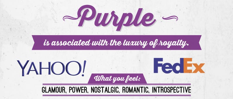
It also provides a sense of creativity and newness, especially on the Internet.
To use purple effectively, avoid using it as a color scheme all by itself. Instead, pair it with a complementary color like blue or pink, or use it with a contrasting color like orange.
When used with a call to action in this way, purple can drive conversions and add a feeling of luxury to your offer.
Brown stands for dependability and earthiness
While it isn’t a very glamorous color, brown has its place as a friendly and stable color. According to Bags and Bows Online, brown invokes a natural and durable sentiment.
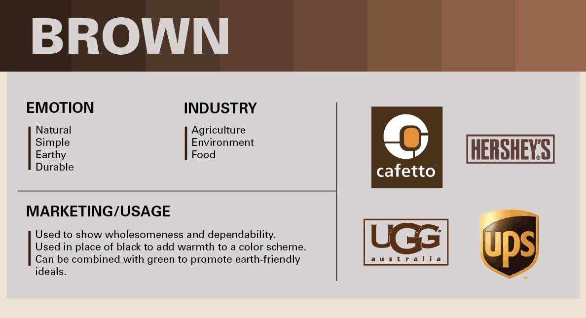
While it isn’t an ideal choice for most brands, it can be used as a way to promote the durability of your offer.
Consider boosting your conversion rates with brown by using it as a background or accent color to show dependability.
Because it doesn’t invoke strong emotions, I’d recommend staying away from using it as the primary color for your call to action.